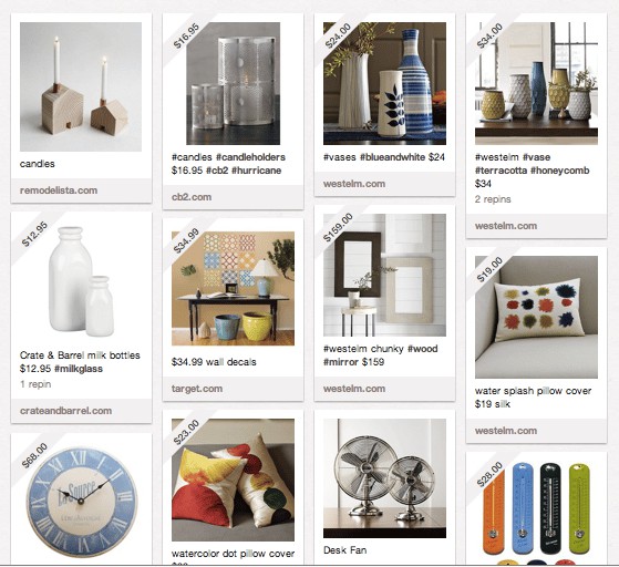
If Pinterest is attracting heat for copying publishers’ content, perhaps it’s only fair that publishers give the same treatment to the budding social pinboard curation network.
To that end, Condé Nast has given the website for its UK edition of Easy Living magazine a makeover that looks more than a little inspired by the voguish new network…
“The site is designed to echo the Easy Living print brand,” EasyLiving.co.uk executive editor Natasha McNamara tells paidContent. “If this means it’s also as attractive and appealing as the lure of pinboards found in so many homes and now replicated online, then that’s great.
“The new site is a deliberate move away from the standard web template and welcomes in the new world of responsive design.
“We’ve worked closely with the editorial print team, giving all stories equal weight and laid out in a clean, impactful postcard style format, with the content completely filling the screen, whatever its size.”
The similarity is ironic given the attention, albeit predictable, that Pinterest has been fetching over its own republication of publishers’ content.
Some think the site’s découpage effect, assembling multiple items on a single page to minimise layered navigation, points to a new female web design aesthetic. Before it, in hindsight, Etsy’s index pages perhaps already appeared similar. Easy Living courts a similar audience of homely, design-conscious female makers and crafters. But, then again, the look is also deployed in many visually-minded iPad apps. It’s likely this convention which the web is adopting as its aesthetic.
Now the pinfluence of Pinterest, a network on which people “pin” web content to their pages using images, may be radiating…
Flickr is due to get a redesign that Mashable says is inspired by Pinterest.
Quora’s boards feature borrows a similar style. One reason for the layout convention may be jQuery Masonry, a web stylesheet tool, first launched in 2009, that helps designers make sites using the technique, like Fab.com, Cutest Paw and We And The Color (more at Mashable). And that’s not to mention the out-and-out Pinterest clones.
Grid-layout UI became a popular digital design practice in 2011, adopted by brands like Windows Phone and The Guardian‘s iPad edition.
Now Condé Nast is readying to “reimagine” the websites for Easy Living stablemates Vogue, Wired GQ in the next six months. No word yet on their source of pinspiration.
@RobertAndrews CRIKEY MOSES. It is basically the same thing no? In a way that’s more than a bit bonkers …
— vicky frost (@vickyfrost) February 22, 2012
