Developers have spent the last couple of years tweaking websites for smaller screens using “responsive” design techniques. But screen size is not the only way to adapt experiences for mobile screens.
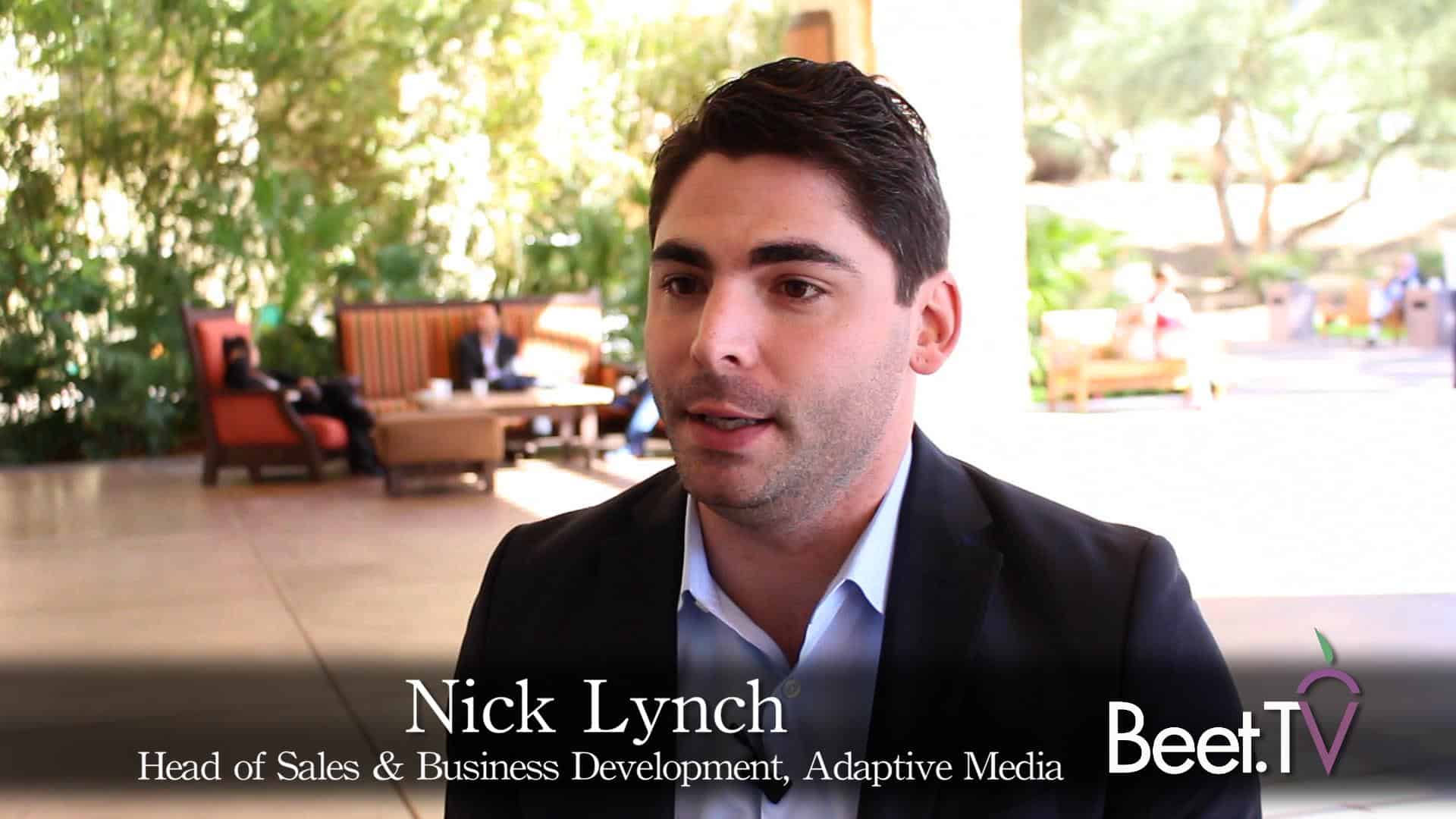
“When we talk about creating a responsive experience … to deliver mobile use the same experience they would have on the desktop … how can they be more responsive based on the connection speed?,” asks Adaptive Media sales and business development head Nick Lynch.
“We are focused on building the (video) player that also identifies the connection speed… that’s going to be really important in terms of responsiveness.”
The company employs around 60 people in Irvine, California. Just don’t ask Lynch to comment on one hackneyed old mobile industry buzzphrase: “I’ve heard it before – ‘this year is the mobile’, ‘next year is the year of mobile’. Mobile is just going to continue to grow, so every year is going to be the year of mobile.”
He was interviewed by Beet.TV at the IAB Annual Leadership Meeting.
Beet.TV coverage of the IAB meeting was sponsored by SpotXchange. Please find Beet.TV’s coverage of the event here.